
Practically tested recipe · Oxygen 6.2 RC1 · 13 October 2026. See the test scope and version notes below.
What it does and when to use it
Group content and create a layout with the right HTML meaning. This example focuses on one achievable outcome rather than listing every possible setting.
Before you start
Use a private test page with Oxygen 6 and a screenshot you have permission to publish. No Breakdance extension, WooCommerce or custom CSS is required for this example. The three linked Container, Text and Image recipes build the same practice project introduction. The values below are example settings.
Worked example: A responsive project introduction
This is a recreated learning example using the service website kit. It is not presented as a completed client project.
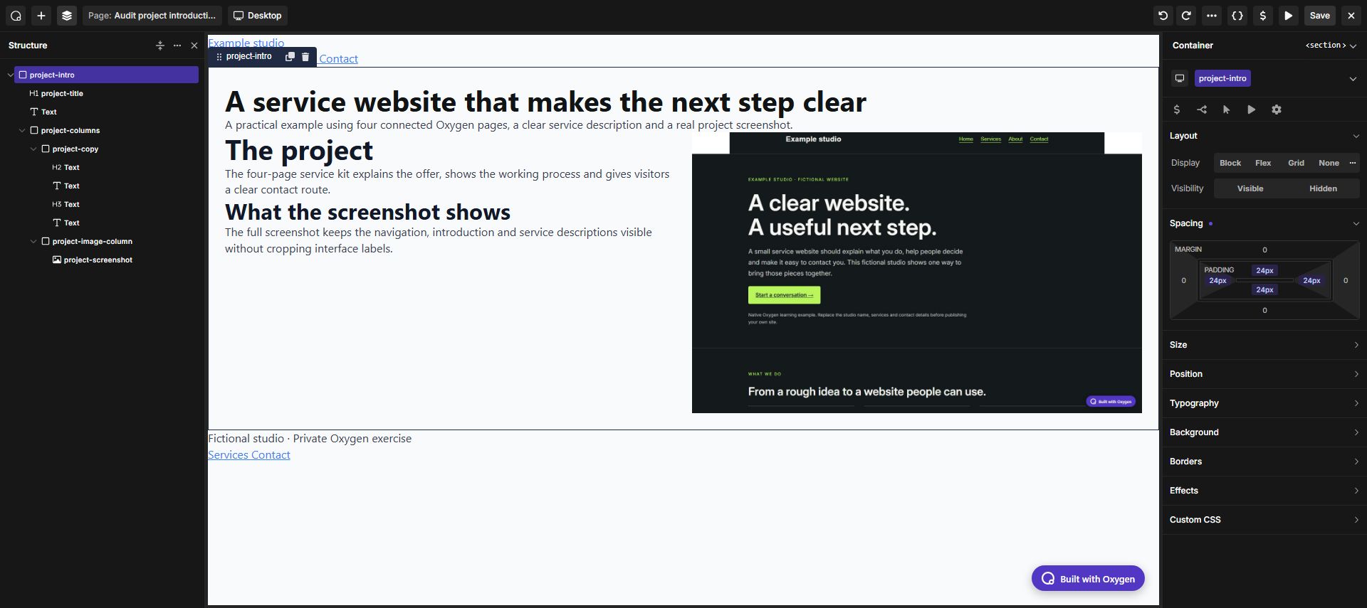
- On a test page, add Container. Use its HTML tag control to select
section, then create the classproject-intro. Under Spacing, enter 24px in Padding and apply it to all four sides. - Inside it, add a Text element with the tag
h1and the title “A service website that makes the next step clear”. Add a second Text element with a paragraph tag for the introduction. Use the Text walkthrough for its typography. - Add a second Container inside the section and name its class
project-columns. In Layout, select Flex, use the right-pointing Flow direction for a row and set Gap to 24px. - Inside
project-columns, add two Containers with the classesproject-copyandproject-image-column. For each child, set Min Width to 0px. In Flex Child, set Grow 1, Shrink 1 and Basis 0px. Leave a fixed width unset. This lets the columns share the available space and shrink around their content. - In the first child, add an
h2Text element named “The project”, a paragraph, then anh3named “What the screenshot shows” and another paragraph. In the second child, add an Image using the project screenshot walkthrough. - Select
project-columnsand switch to Phone Landscape (767px and below in this installation). Change Flow to the downward-pointing column direction. Keep the 24px gap; the two children now stack vertically. - Save, open the frontend and check at 320, 375, 768 and 1440px. Reopen the builder and select the same class to confirm that its spacing and responsive direction remain saved. If your project uses custom breakpoints, apply the stacking change at the breakpoint that fits your content.
Use the Oxygen interface
Select the element or its parent Container, choose the intended shared class, and configure layout, spacing and typography in the builder. Switch to a narrower breakpoint to make responsive overrides. You do not need to paste CSS for this example.
Expected result
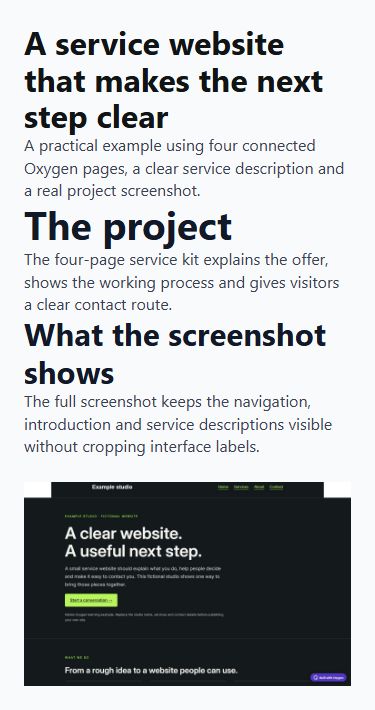
A project introduction with a semantic heading, readable copy and an uncropped screenshot. The two columns become a vertical stack on phones.
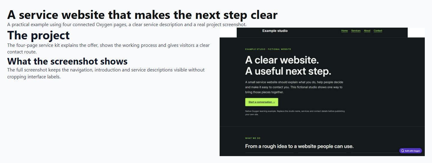
View the actual 375px mobile result. At phone widths the image appears below the text. The 1440 × 900 source image keeps its natural proportions.
Troubleshooting
If an image forces horizontal scrolling, constrain its width and let the layout columns shrink. Do not add more wrappers to hide an overflowing child.
Checks before publishing
Avoid extra wrappers with no purpose. A section needs a meaningful heading; a visual box does not automatically need a section tag.
- Compare desktop and narrow-screen layouts using actual content.
- Follow every destination and operate interactive controls with a keyboard where applicable.
- Check an empty or unavailable-data state when the element depends on a provider.
Official reference and version notes
Official Container reference provides the current provider information. This is independent, AI-assisted documentation on Benjamin Olsen’s website; examples are clearly identified as practice recipes.
Reproduced through the Oxygen interface on 13 October 2026 using Oxygen 6.2 RC1, WordPress 7.1.2 and PHP 8.5.11 in a private SQLite test installation. The saved frontend was checked at 320, 375, 768 and 1440px: no page-level horizontal overflow, correct heading tags, responsive columns and image alt text. Settings were saved and checked after reopening the builder. This verifies the recipe below, not every element option, every browser or a complete accessibility audit. The live website was not upgraded.